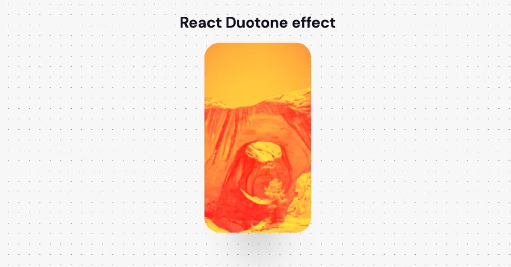
Duotone design refers to creations that are made up of two contrasting colors. Much like what it describes, the word “duotone” has two parts: “duo,” meaning double, and “tone,” meaning color.
If you're impatient like me, grab the Codesandbox code right away
Let's start!
Setup
The best way to start building a new single-page application in React is by using create-react-app. Replace the duotone-app text with your app's name.
npx create-react-app duotone-app
The only external library is the CSS-in-JS library React styled-components. It comes in handy when you want to pass variables in your CSS. The installation command is the following:
yarn add styled-componentsHow it works
Our approach is based on the hacky way described in this tweet by Una Kravetz.
The image is set as a background-image of a div element. Then, we utilize the ::before and ::after pseudo-selectors to add two colored overlay layers above the div. The hack is on using the CSS property mix-blend-mode to blend the overlay layers with the original image.
The mix-blend-mode CSS property sets how an element's content should blend with the content of the element's parent and the element's background.
One important point here is that the colors have to be contrasting to make the effect aesthetically pleasing!
Build the Duotone component
The React component will get as props the url of your image and two contrasting colors:
<Duotone
  src="<https://source.unsplash.com/random>"
  lightColor={lightColor}
  darkColor={darkColor}
/>
Defining the actual div element with the background-image property is our 1st task.
const Duotone = styled.div`
  background-image: url(${props => props.src});
  background-repeat: no-repeat;
  background-size: 100% 100%;
  background-position: 50% 50%;

  position: relative;

  /* Setup the fixed dimensions */
  width: 225px;
  min-height: 400px;
`
The position: relative rule is necessary to position the overlay layers relative to the original div. Unfortunately, there is one small drawback with this method. You have to specifically know and set the dimension of your image.
Now, we're ready to apply the selectors that represent the overlay layers. The ::before selector sets as background color the lightColor with mix-blend-mode: darken. In that way, the background is replaced with the content where the content is , otherwise, it is left as it was.
&::before {
  background-color: ${props => props.lightColor};
  content: "";
  display: block;
  border-radius: 32px;
  width: 100%;
  height: 100%;
  mix-blend-mode: darken;
  position: absolute;
}
Then, we simple apply the ::after selector too. Here, the backgroud get the darkColor and set the CSS rule mix-blend-mode: lighten to replace the background with the content where the content is lighter.
&::after {
  background-color: ${props => props.darkColor};
  content: "";
  display: block;
  border-radius: 32px;
  width: 100%;
  height: 100%;
  mix-blend-mode: lighten;
  position: absolute;
}
Our component is ready!
Real-life use case
I used the Duotone component for the root page of this blog.
As you've already noticed, the blog has multiple theming options. The problem was how could I adapt my header image to the active theme. My initial thought was to use a gradient overlay above the image. But I didn't like this idea due to its aesthetic result.
By implemementing the Duotone component, I was able to easily customize the image based on the active primary and secondary colors and produce an eye-catching effect.
The final Duotone React component
Here is the final Duotone React component:
const Duotone = styled.div`
  background-image: url(${props => props.src});
  background-repeat: no-repeat;
  background-size: 100% 100%;
  background-position: 50% 50%;

  position: relative;

  /* Setup the fixed dimensions */
  width: 225px;
  min-height: 400px;


  &::before {
    background-color: ${props => props.lightColor};
    content: "";
    display: block;
    border-radius: 32px;
    width: 100%;
    height: 100%;
    mix-blend-mode: darken;
    position: absolute;
  }

  &::after {
    background-color: ${props => props.darkColor};
    content: "";
    display: block;
    border-radius: 32px;
    width: 100%;
    height: 100%;
    mix-blend-mode: lighten;
    position: absolute;
  }
`
.jpg?table=block&id=5da08adb-020e-442d-ba9a-9618414c7311&cache=v2)
.webp?table=block&id=2442a2a4-3cc1-49ef-92a1-eb8fb9949d7b&cache=v2)