
✏️ EDITED TO SUPPORT VERSION 1.0
For impatient folks (like me), you can 🎁 Grab the Github repository right now:
Installation
We'll create a new project using create-react-app and name it landing-page.
npx create-react-app landing-page-chakra-ui
cd landing-page-chakra-ui
Next, we'll install the Chakra UI library and its dependencies.
npm i @chakra-ui/react @emotion/react @emotion/styled framer-motion

# or

yarn add @chakra-ui/react @emotion/react @emotion/styled framer-motion
For setting up the Chakra UI with React we'll need its ChakraProvider and optionally a custom theme. You can check my previous article about the complete installation.

Define the folder structure
There is a huge discussion on the ideal React folder structure. I believe there is no perfect folder structure, you just pick a clear structure that fits your goals and it's comprehensible.
I apply the KISS principle ("Keep It Simple, Stupid") for the folder structure. It consists of three core directories pages, components, and utils.
├─ public
├─ src
    └─ components
        └─ layouts
        └─ sections
        └─ ui
    └─ utils
    └─ App.js
    └─ index.js
Components folder
The components folder has three sub-directories:
- The
sectionsfolder with all the sections (eg. Hero, Header, Footer)
- The
layoutsfolder that includes the layout for our main pages (eg. LandingLayout, AuthLayout)
- The
uifolder with all the smaller components that have no business logic or side effects (eg. Logo, Button)
Pages folder
In the pages folder, you can place all the pages of our landing page, e.g. Home, About, SignUp, Login, and so on.
Each page renders a layout and consists of many sections. Every section component takes as props its main variables (text, images, links), so it's super easy to customize your pages.
Utils folder
The utils folder includes all the function helpers (eg. our custom theme).
A rule of thumb is to create a helper function when you need specific functionalities in more than one place.
<div style="height: 1px; width: 1px; margin-bottom: 2rem"></div>
Setup App component
Routing is optional for the specific tutorial since it's a simple one-pager. However most real-life landing pages have multiple pages, so I set it up here to save you some time.
The App component will handle the routing of our app. Of course, we'll go with the state-of-the-art library react-router-dom library.
You can install it by typing the following command:
yarn add react-router-domRouting is optional for our tutorial since it will be a single-page landing page. However most real-life landing pages have multiple pages, so I set it up here to make your life easier.
Our setup will be simple. If you need to learn more advanced details you can check the official docs
We must wrap our application with the BrowserRouter component that keeps the UI in sync with the URL. The BrowserRouter is recommended over the plain Router because it handles the history object internally.
Then, we define our Route components (only / for our example) and wrap them with the Switch component.
The Switch component selects the route that matches the current location and returns only one component.
import React from "react"
import { BrowserRouter, Switch, Route } from "react-router-dom"

import Landing from "./pages/Landing"

export default function App() {
  return (
    <BrowserRouter>
      <Switch>
        <Route path="/">
          <Landing />
        </Route>
      </Switch>
    </BrowserRouter>
  )
}
Create the layout
Now it's time to create the LandingLayout.js file and place it into the /components/layouts folder.
This component will always render the header, the footer, and any components that are passed as children.
To achieve the vertical layout of a landing page we have to add the Flex Chakra UI component. It renders as a classic div element with display: flex. The Flex component has some helpful shorthand props:
flexDirectionisdirection
flexWrapiswrap
alignItemsisalign
justifyContentisjustify
So, the initial LandingLayout component is a column centered flexbox that renders the Header component and all of its children. To center the layout and make it responsive, we add the margin: 0 auto CSS style and set the max-width: 1200px for large displays.
There are two ways in Chakra UI to define responsive styles. Depending on the occasion, you can choose the more appropriate and readable solution.
  // First option
  maxW={[
      "auto",    // 0-30em
      "auto",    // 30em-48em
      "auto",    // 48em-62em
      "1200px",  // 62em+
    ]}

  // Second option
  maxW={{
    base: "auto", // 0-80em
    xl: "1200px" // 80em+
  }}
The complete LandingLayout component is the following:
import React from "react"
import { Flex } from "@chakra-ui/react"
import Header from "../sections/Header"
import Footer from "../sections/Footer" // will add this in the part 2

export default function LandingLayout(props) {
  return (
    <Flex
      direction="column"
      align="center"
      maxW={{ xl: "1200px" }}
      m="0 auto"
      {...props}
    >
      <Header />
      {props.children}
      <Footer />
    </Flex>
  )
}
The next step is to create the Header component that is inside LandingLayout.
The responsive Header component
The Header.js file will be in the /components/sections folder.
The starting point to this component was this code by Jean Bauer at the official Chakra UI docs.
We'll make some adjustments to make the component fully responsive and enhance its UI.
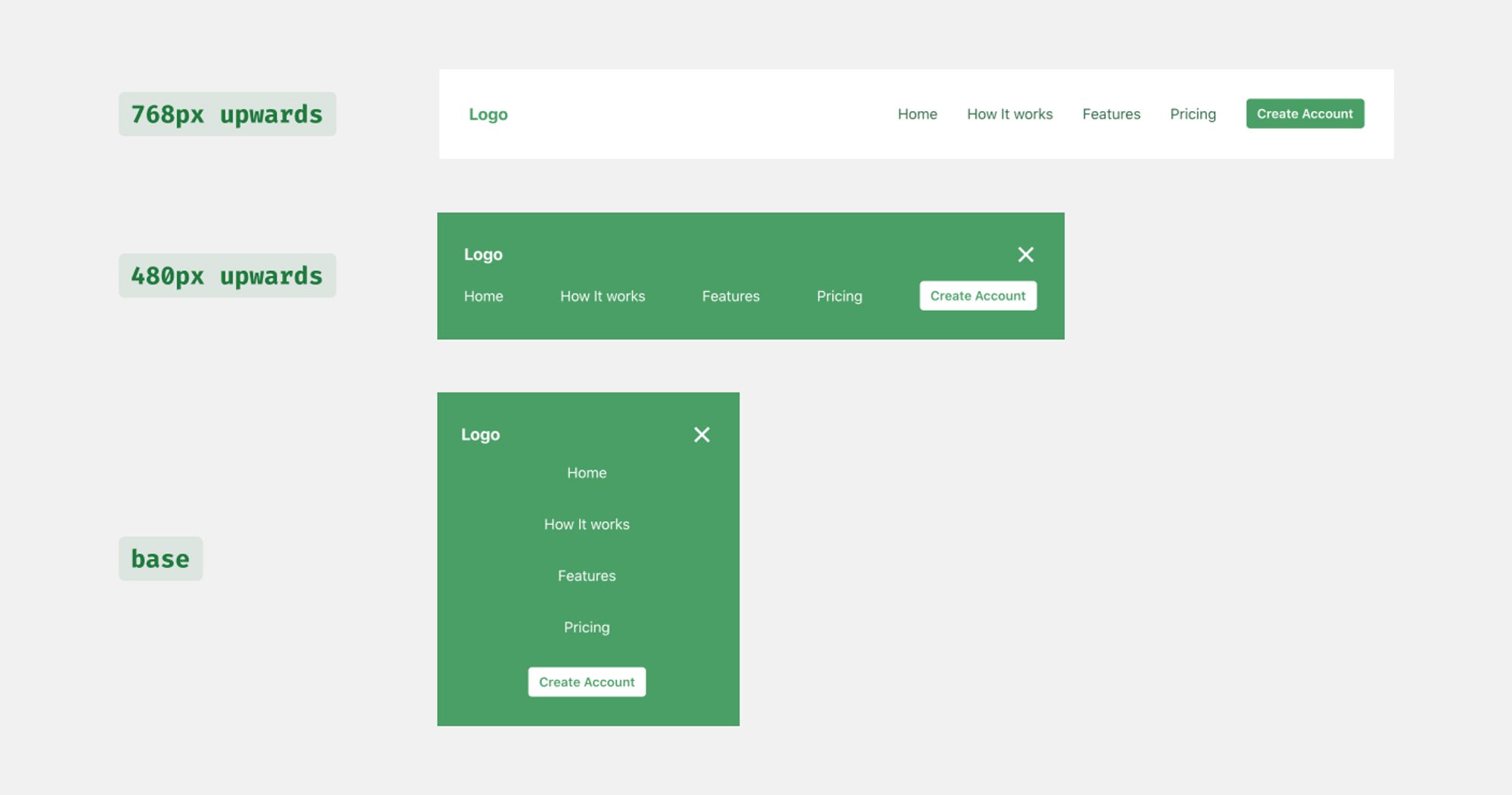
The outermost component is a row flexbox rendered as a nav element. The justify attribute is set to space-between to leave the appropriate space between the logo and the actual menu.
Also, we set the background-color and the color rules to the color combinations we displayed at the image above based on the active screen size.
<Flex
  as="nav"
  align="center"
  justify="space-between"
  wrap="wrap"
  w="100%"
  mb={8}
  p={8}
  bg={["primary.500", "primary.500", "transparent", "transparent"]}
  color={["white", "white", "primary.700", "primary.700"]}
  {...props}
>
  ...
</Flex>
The basic trick we'll apply here is to hide/show the menu icon and the menu items by applying conditionally the CSS rules display: block and display: none.
The menu/close icon will be visible only on the base case and hidden on screens larger than the md breakpoint. Depending on the show value, we show either the CloseIcon (if show is true) or MenuIcon (when show is false).
<Box display={{ base: "block", md: "none" }} onClick={toggleMenu}>
  {show ? <CloseIcon /> : <MenuIcon />}
</Box>
The same trick is used for the menu items. The items are always shown on screens larger than the md breakpoint and conditionally on smaller displays. The condition depends on the state of the show variable, which is toggled by pressing the Menu/Close icon.
One small notice here is the use of the flex-basic CSS property. It sets the initial main size of a flex item. We use the property to force the items in a new line when the menu icon is present. It is combined with the rule flex-wrap: wrap from the outermost Flex component that allows its children to break into a new line.
<Box
  display={{ base: show ? "block" : "none", md: "block" }}
  flexBasis={{ base: "100%", md: "auto" }}
>
  ...
</Box>
Inside that Box lives our actual menu. To make our life easier, we'll use a Flex container that is responsible for defining the direction of the children's elements and justifying their position.
A quick note here. Instead of the Flex component we could have chosen the Stack component. But in our case, the Stack components introduced some UI bugs and went with the Flex.
<Flex
  align="center"
  justify={["center", "space-between", "flex-end", "flex-end"]}
  direction={["column", "row", "row", "row"]}
  pt={[4, 4, 0, 0]}
>
  ...
</Flex>
For the menu items, we create a separate MenuItem component that renders a Text component with a Link to the desired location.
Duo to the use of a Flex component as a container, we have to manually set the spacing between the menu items.
This is achieved by passing the isLast. This prop indicates whether (or not) we have to add the appropriate margin to the MenuItem.
const MenuItem = ({ children, isLast, to = "/", ...rest }) => {
  return (
    <Text
      mb={{ base: isLast ? 0 : 8, sm: 0 }}
      mr={{ base: 0, sm: isLast ? 0 : 8 }}
      display="block"
      {...rest}
    >
      <Link to={to}>{children}</Link>
    </Text>
  )
}
The final Header component is below:
import React from "react"
import { Link } from "react-router-dom"
import { Box, Flex, Text, Button, Stack } from "@chakra-ui/react"
import Logo from "../ui/Logo"

import { CloseIcon, MenuIcon } from ".../Icons"

const MenuItems = (props) => {
  const { children, isLast, to = "/", ...rest } = props
  return (
    <Text
      mb={{ base: isLast ? 0 : 8, sm: 0 }}
      mr={{ base: 0, sm: isLast ? 0 : 8 }}
      display="block"
      {...rest}
    >
      <Link to={to}>{children}</Link>
    </Text>
  )
}

const Header = (props) => {
  const [show, setShow] = React.useState(false)
  const toggleMenu = () => setShow(!show)

  return (
    <Flex
      as="nav"
      align="center"
      justify="space-between"
      wrap="wrap"
      w="100%"
      mb={8}
      p={8}
      bg={["primary.500", "primary.500", "transparent", "transparent"]}
      color={["white", "white", "primary.700", "primary.700"]}
      {...props}
    >
      <Flex align="center">
        <Logo
          w="100px"
          color={["white", "white", "primary.500", "primary.500"]}
        />
      </Flex>

      <Box display={{ base: "block", md: "none" }} onClick={toggleMenu}>
        {show ? <CloseIcon /> : <MenuIcon />}
      </Box>

      <Box
        display={{ base: show ? "block" : "none", md: "block" }}
        flexBasis={{ base: "100%", md: "auto" }}
      >
        <Flex
          align={["center", "center", "center", "center"]}
          justify={["center", "space-between", "flex-end", "flex-end"]}
          direction={["column", "row", "row", "row"]}
          pt={[4, 4, 0, 0]}
        >
          <MenuItems to="/">Home</MenuItems>
          <MenuItems to="/how">How It works </MenuItems>
          <MenuItems to="/faetures">Features </MenuItems>
          <MenuItems to="/pricing">Pricing </MenuItems>
          <MenuItems to="/signup" isLast>
            <Button
              size="sm"
              rounded="md"
              color={["primary.500", "primary.500", "white", "white"]}
              bg={["white", "white", "primary.500", "primary.500"]}
              _hover={{
                bg: [
                  "primary.100",
                  "primary.100",
                  "primary.600",
                  "primary.600",
                ],
              }}
            >
              Create Account
            </Button>
          </MenuItems>
        </Flex>
      </Box>
    </Flex>
  )
}

export default Header
Let's dive into the Hero section
The hero section is the most important part of any landing page. It's the first part, the user interacts with and it has to be perfect!
As you can see below, the section is composed of two core elements. The image and the main content (header, subtitle, CTA button).
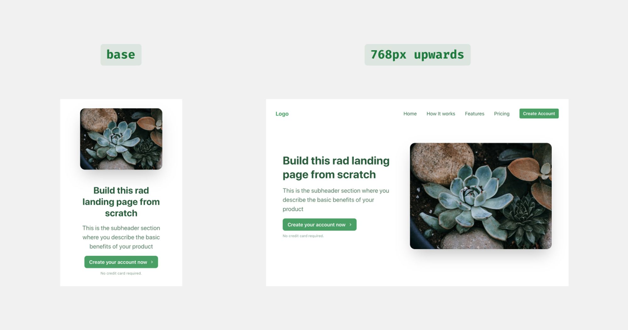
Before going further, this is the place we have to define the props for our components. The main variables for our hero section are five. The text for the title, the subtitle and the button, the URL of the image, and the CTA's link.
export default function Hero({
  title,
  subtitle,
  image,
  ctaLink,
  ctaText,
  ...rest
}) {
  return ();
}
About the actual code, the top container will be a Flex component again. According to the screen dimensions, we'll gonna change its flex-direction and justify-content properties.
For the mobile device, we set the direction to column-reverse. The reason behind that choice is that we want to change the order of the two main elements.
The rest prop is passed to let as manipulate the outermost container of the Herocomponent from outside.
<Flex
  align="center"
  justify={{ base: "center", md: "space-around", xl: "space-between" }}
  direction={{ base: "column-reverse", md: "row" }}
  wrap="no-wrap"
  minH="70vh"
  px={8}
  mb={16}
  {...rest}
>
  ...
</Flex>
The min-height attribute is passed to justify that the section will be vertically centered on large displays. You can see the difference in the image below.
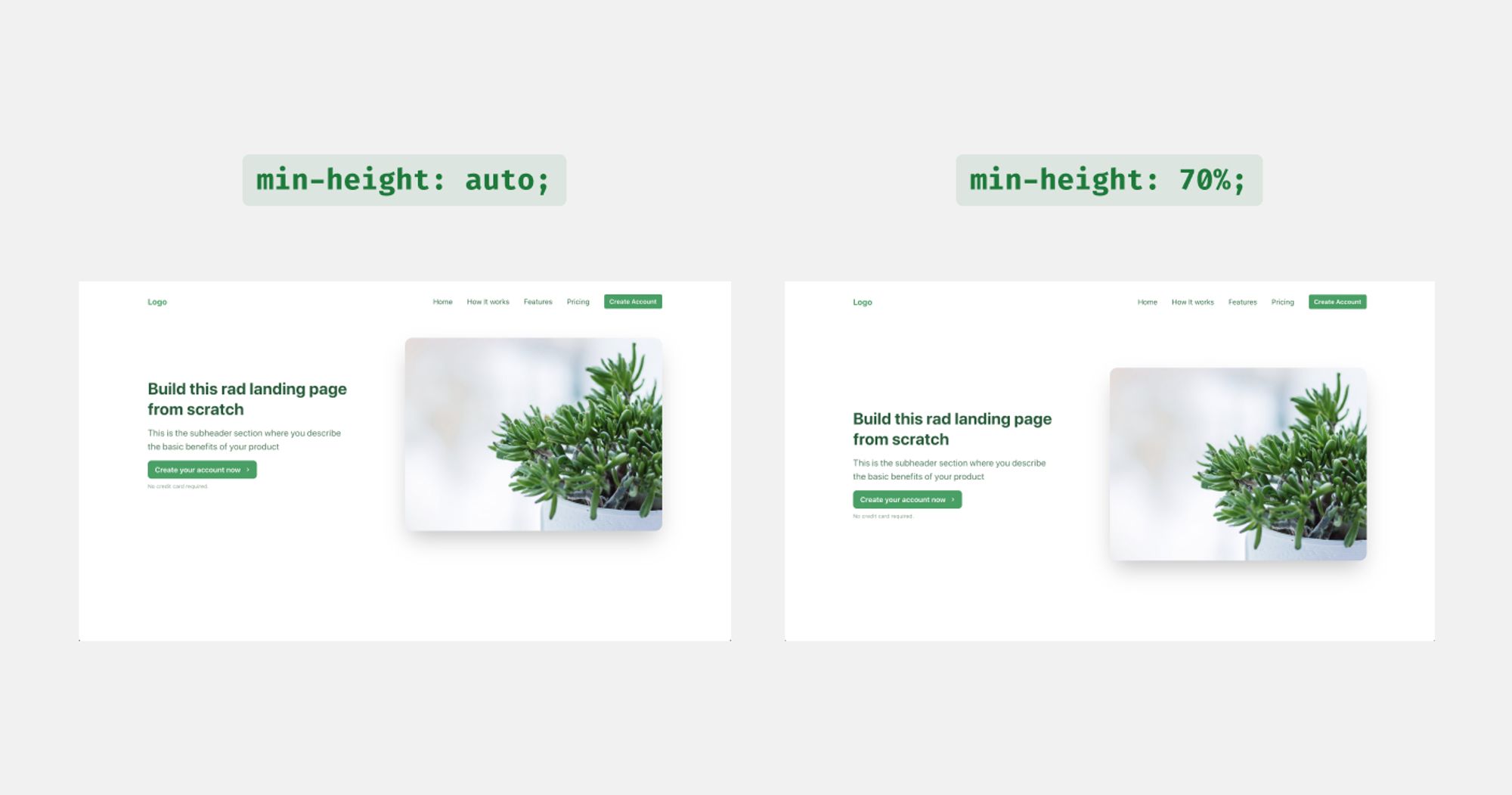
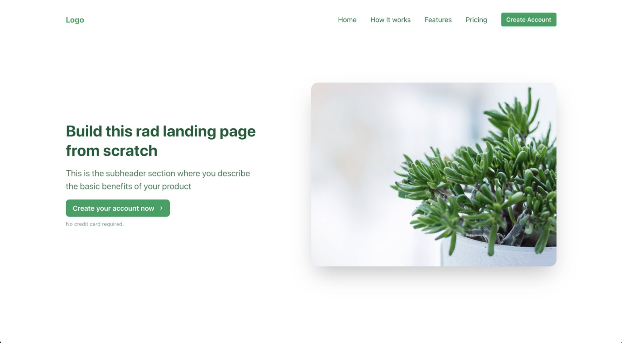
min-height.Now, it's time for the image component. The only action to be done is to adjust the width. On small devices, we want to force width: 80% and progressively make it less.
Also, we add a margin-bottom on small screens to make the space between the image and the content larger.
<Box w={{ base: "80%", sm: "60%", md: "50%" }} mb={{ base: 12, md: 0 }}>
  <Image src={image} size="100%" rounded="1rem" shadow="2xl" />
</Box>
About the content element, it's a simple Stack element that includes two Heading components, the Button and a Text component about the text below the button.
The only remarkable thing here is the alignment of the elements which should be centered on mobile and at the left side for bigger screens.
<Stack
  spacing={4}
  w={{ base: "80%", md: "40%" }}
  align={["center", "center", "flex-start", "flex-start"]}
>
  <Heading
    as="h1"
    size="xl"
    fontWeight="bold"
    color="primary.800"
    textAlign={["center", "center", "left", "left"]}
  >
    {title}
  </Heading>
  <Heading
    as="h2"
    size="md"
    color="primary.800"
    opacity="0.8"
    fontWeight="normal"
    lineHeight={1.5}
    textAlign={["center", "center", "left", "left"]}
  >
    {subtitle}
  </Heading>
  <Link to={ctaLink}>
    <Button
      colorScheme="primary"
      borderRadius="8px"
      py="4"
      px="4"
      lineHeight="1"
      size="md"
    >
      {ctaText}
    </Button>
  </Link>
  <Text
    fontSize="xs"
    mt={2}
    textAlign="center"
    color="primary.800"
    opacity="0.6"
  >
    No credit card required.
  </Text>
</Stack>
The Hero component is ready and you can see the complete code below:
import React from "react"
import { Link } from "react-router-dom"
import PropTypes from "prop-types"
import {
  Box,
  Button,
  Flex,
  Image,
  Heading,
  Stack,
  Text,
} from "@chakra-ui/react"

export default function Hero({
  title,
  subtitle,
  image,
  ctaLink,
  ctaText,
  ...rest
}) {
  return (
    <Flex
      align="center"
      justify={{ base: "center", md: "space-around", xl: "space-between" }}
      direction={{ base: "column-reverse", md: "row" }}
      wrap="no-wrap"
      minH="70vh"
      px={8}
      mb={16}
      {...rest}
    >
      <Stack
        spacing={4}
        w={{ base: "80%", md: "40%" }}
        align={["center", "center", "flex-start", "flex-start"]}
      >
        <Heading
          as="h1"
          size="xl"
          fontWeight="bold"
          color="primary.800"
          textAlign={["center", "center", "left", "left"]}
        >
          {title}
        </Heading>
        <Heading
          as="h2"
          size="md"
          color="primary.800"
          opacity="0.8"
          fontWeight="normal"
          lineHeight={1.5}
          textAlign={["center", "center", "left", "left"]}
        >
          {subtitle}
        </Heading>
        <Link to={ctaLink}>
          <Button
            colorScheme="primary"
            borderRadius="8px"
            py="4"
            px="4"
            lineHeight="1"
            size="md"
          >
            {ctaText}
          </Button>
        </Link>
        <Text
          fontSize="xs"
          mt={2}
          textAlign="center"
          color="primary.800"
          opacity="0.6"
        >
          No credit card required.
        </Text>
      </Stack>
      <Box w={{ base: "80%", sm: "60%", md: "50%" }} mb={{ base: 12, md: 0 }}>
        <Image src={image} size="100%" rounded="1rem" shadow="2xl" />
      </Box>
    </Flex>
  )
}

Hero.propTypes = {
  title: PropTypes.string,
  subtitle: PropTypes.string,
  image: PropTypes.string,
  ctaText: PropTypes.string,
  ctaLink: PropTypes.string,
}

Hero.defaultProps = {
  title: "React landing page with Chakra UI",
  subtitle:
    "This is the subheader section where you describe the basic benefits of your product",
  image: "<https://source.unsplash.com/collection/404339/800x600>",
  ctaText: "Create your account now",
  ctaLink: "/signup",
}
Sum up
That's all folks for today. The landing page should look like this until now.
.jpg?table=block&id=5da08adb-020e-442d-ba9a-9618414c7311&cache=v2)
.webp?table=block&id=2442a2a4-3cc1-49ef-92a1-eb8fb9949d7b&cache=v2)